 |
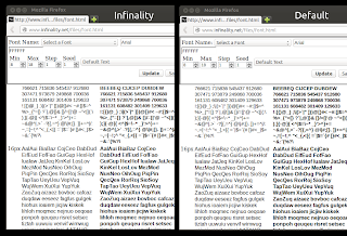
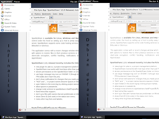
| On the left: Infinality (using the Linux style); on the right: the default Ubuntu font configuration |
Click HERE to zoom in so you can better see the details.
The screenshot above uses the Linux Infinality style, but there are many other style you can choose from, as I was saying above.
Install and configure Infinality for better font rendering in Linux
sudo add-apt-repository ppa:no1wantdthisname/ppa
sudo apt-get update
sudo apt-get upgrade
sudo apt-get install fontconfig-infinality
Once installed, log out and log back in.
echo "deb http://ppa.launchpad.net/no1wantdthisname/ppa/ubuntu trusty main" | sudo tee /etc/apt/sources.list.d/infinality.list
echo "deb-src http://ppa.launchpad.net/no1wantdthisname/ppa/ubuntu trusty main" | sudo tee -a /etc/apt/sources.list.d/infinality.list
sudo apt-key adv --keyserver keyserver.ubuntu.com --recv-keys E985B27B
For another way of getting better fonts in Debian, see THIS article (it’s in Spanish but you only need the commands).
Installing Infinality in other Linux distributions:
- Fedora (official Infinality repository) and generic installation instructions
- Arch Linux: the easy way | the generic way (AUR)
- openSUSE repository
- Debian installation instructions (build instructions and pre-built binaries)
sudo bash /etc/fonts/infinality/infctl.sh setstyleOptional: next, open /etc/profile.d/infinality-settings.sh with a text editor as root – I’ll use Gedit below:
sudo -H gedit /etc/profile.d/infinality-settings.shAnd in this file, search for USE_STYLE (it should be USE_STYLE=”DEFAULT” by default) and change it to one of the following styles (I recommend using “UBUNTU” here but you should also try the default to see which one you like better):
- DEFAULT – A compromise that should please most people;
- OSX – Simulate OSX rendering;
- IPAD – Simulate iPad rendering;
- UBUNTU – Simulate Ubuntu rendering;
- LINUX – Generic “Linux” style – no snapping or certain other tweaks;
- WINDOWS – Simulate Windows rendering;
- WINDOWS7 – Simulate Windows rendering with normal glyphs;
- WINDOWS7LIGHT- Simulate Windows 7 rendering with lighter glyphs;
- WINDOWS – Simulate Windows rendering;
- VANILLA – Just subpixel hinting;
- CUSTOM – Your own choice;
- Infinality styles:
- CLASSIC – Infinality rendering circa 2010. No snapping;
- NUDGE – CLASSIC with lightly stem snapping and tweaks;
- PUSH – CLASSIC with medium stem snapping and tweaks;
- SHOVE – Full stem snapping and tweaks without sharpening;
- SHARPENED – Full stem snapping, tweaks, and Windows-style sharpening;
- INFINALITY – Settings used by the Infinality developer;
- DISABLED – Act as though running without the extra infinality enhancements (just subpixel hinting).
For discussion, bug reports and so, visit the Infinality forums.
Update: for improved font rendering in Java / Swing applications (OpenJDK 7), see this article: Install OpenJDK Patched With Font Fixes [Ubuntu PPA]
Reverting the changes
sudo apt-get purge fontconfig-infinality
sudo apt-get install ppa-purge
sudo ppa-purge ppa:no1wantdthisname/ppa
Once the PPA is purge, log out and log back in.
sudo apt-get purge fontconfig-infinality
sudo rm /etc/apt/sources.list.d/infinality.list
sudo apt-get update
– 32bit:
sudo apt-get install libfreetype6/stable– 64bit:
sudo apt-get install libfreetype6/stable libfreetype6:i386/stableNote: you also need to downgrade libfreetype6-dev if it’s installed and also, libfreetype6:i386 may not be installed. You may want to check if those packages are installed by using “apt-cache policy” (example: “apt-cache policy libfreetype6-dev”).
Revisions
- January 14, 2016 @ 14:32:34 [Current Revision] by admin
- January 14, 2016 @ 14:32:34 by admin


No comments yet.